Know how to get the best color code for your website
W orld is full of life with beautiful colors and so is the website. A lively website often amazes the visitor with its unique blend of colors, presentation and staging. A website equipped with right color scheme caters to great traffic to the website and also enhances the user engagement to the website. Often, the visitor decides to stay on the website or go back to the search page within first few seconds. There are many factors contributing the user to stay and explore the website. Color blend and presentation of the website are one of the prime factors.
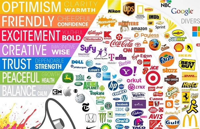
Color psychology describes how the human mind races and reacts to colors and the visible change in the perception. With the positive color scheme, the website and the traffic gets a positive competitive edge like never before. Often gloomy websites with dull color preferences end up in the low visitor engagement to the website, often seen visitors leaving in the first few seconds.
The colors give pleasant aroma to the website, with which you can drag them to be associated to you , providing them what they need at the appropriate places of the website.
Here are the hints to choose colors for a better user friendly website.

1.Get the deal with natural color palette
L et your visitors enjoy their time browsing your website. Get the natural color palette where the user feels comfortable and lively while surfing your inner pages. You don’t want your users to haunt with un-natural colors such as tallow, red and orange. Realize that these un -natural colors work best for the promotional counterparts and not for the lively website. Produce a right amount of blend to your natural colors with the contrast for an appealing output.
2.Stick with 3 prominent colors consistently in your website
W hile there is no hard and fast rule in the usage of number of colors in a website, yet it is recommended to go for an average of 3 colors which rightly symbolizes the brand and use these 3 consistently in your website. More than 5 colors make a disproportionate usage and create eye fatigue to the user and may comprehend to skip the important parts of the website.
3.Right use of background and text
A s they say, readability is the focal point for the user to be engaged to the website. Yes it is !! There should be a clear contrast on the background with the text color to enhance view and readability to the website.
Selecting the background and comprehending the right text color gives an appealing look to the content and makes the user go ahead with the browsing. When the readability is compromised, the user makes his way out of the website in no time.
4.Succumb the logo color to the established brands
R emember brand is the prominent part of a business and when a website has to be redesigned for established brands, the new look of the website needs to be inline with the brand logo and its colors. For the brand owners might not want to mess up with their identity. For instance Coca cola is instantly identified among the beverages given its logo and the stern use of red and white colors. The renovation and redesign of the existing brands should be in accordance to their current colors and logos.
5.Know your audience and their taste
T here is a lot of theory in place to differentiate the choice of colors among male and female and old vs young visitors. Choosing colors according to the tastes of the target audience is necessary to get the most of the website. For instance female are more inclined to the colors like pink, yellow and purple whereas male chose to have blue and dominant colors. If the website in context is a retail one, go with the colors suitable to the audience choice. For example for a retail clothing website design, select the colors differently for the male and female clothing pages. This holds true for different audience accordingly.


